Overview
IPmart.com, a leading online marketplace for electronics and gadgets, sought to revamp its website to improve usability and design. Reporting directly to the CTO, I collaborated closely with a specialist senior developer to bring this project to life, leveraging tools like Adobe Photoshop and Illustrator to create a visually appealing and functional design.
©2009 – 2011
My Role
As the Web Designer, I was responsible for:
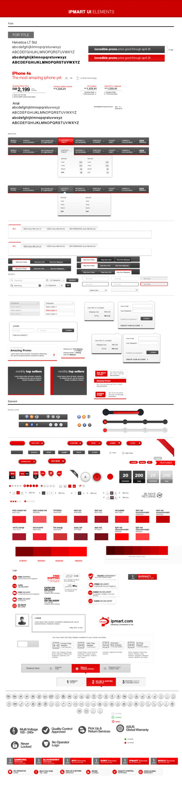
- Designing a modern and user-friendly layout using Adobe Photoshop and Illustrator.
- Collaborating with marketing to create visually engaging campaigns that embodied the brand’s thrilling essence.
- Reporting directly to the CTO to align design goals with business objectives.
Team Involved
- Product Manager
- User Researcher
- Marketing Team
- Developers
Problem
The previous IPmart website had an outdated interface and inconsistent design elements, which hindered user engagement and created navigation challenges. The redesign was necessary to enhance the user experience and align with clean design.
01.
Action
Analysis & Planning
- Conducted a detailed review of the existing website to identify usability pain points.
- Researched competitors and industry trends (Walmart & Target) to design improvements.
Phased Redesign Approach
We began the revamp by focusing on specific areas—icons, buttons, layout, and homepage—tackling each in separate phases to ensure a structured and efficient process:
- Phase 1: Icon Updates
Replaced icons with modern, cohesive designs to enhance visual clarity and consistency. - Phase 2: Button Redesign
Refreshed button styles to make them visually engaging and aligned with the brand identity. - Phase 3: Layout Adjustments
Rearranged layout positions to streamline the user journey, prioritizing accessibility for key features. - Phase 4: Page Revamp
Designed a comprehensive layout for all pages, focusing on intuitive navigation and an appealing visual hierarchy.
Collaboration & Tools
- Worked closely with the senior developer to implement each phase, ensuring seamless integration into the platform.
- Used Adobe Photoshop and Illustrator to create visual elements, from icons to high-fidelity mockups.
02.
Solution
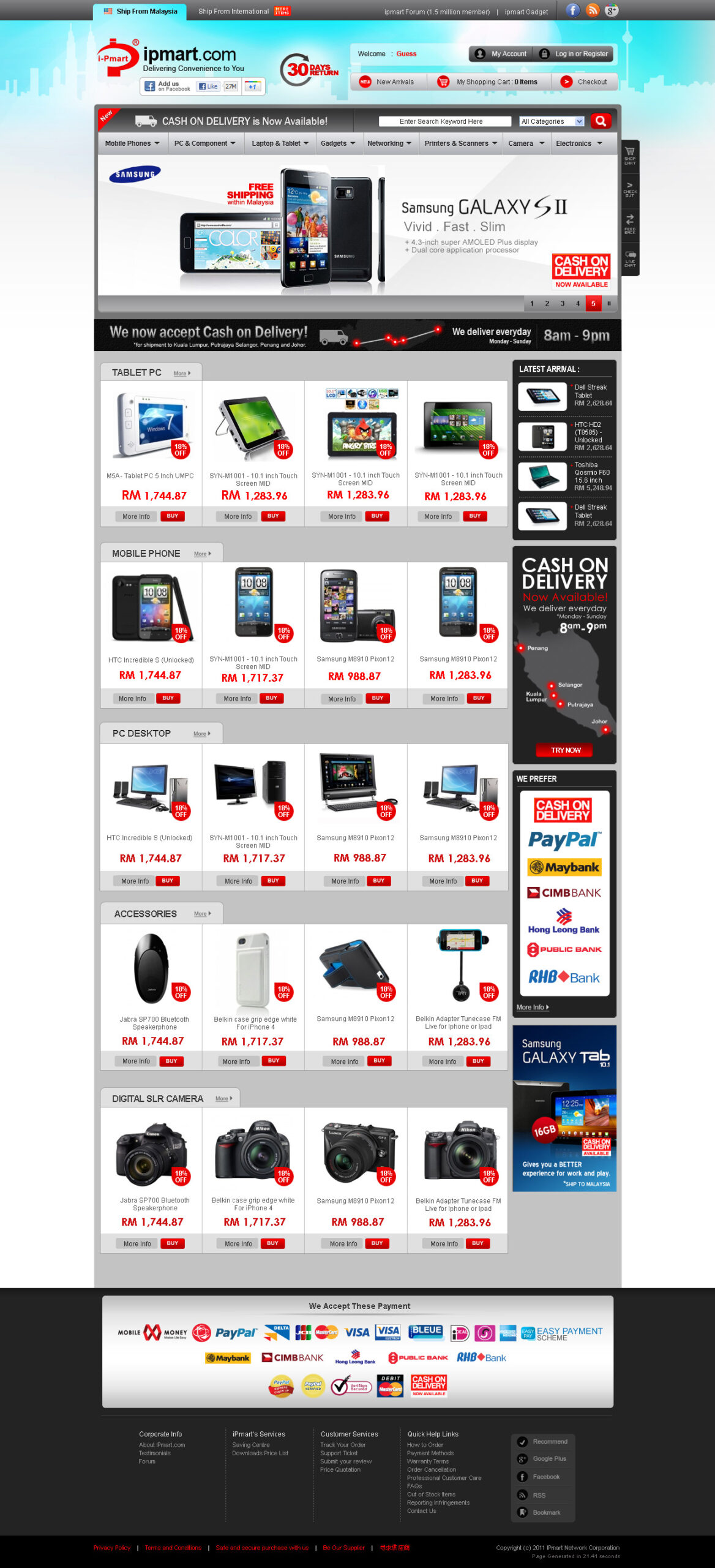
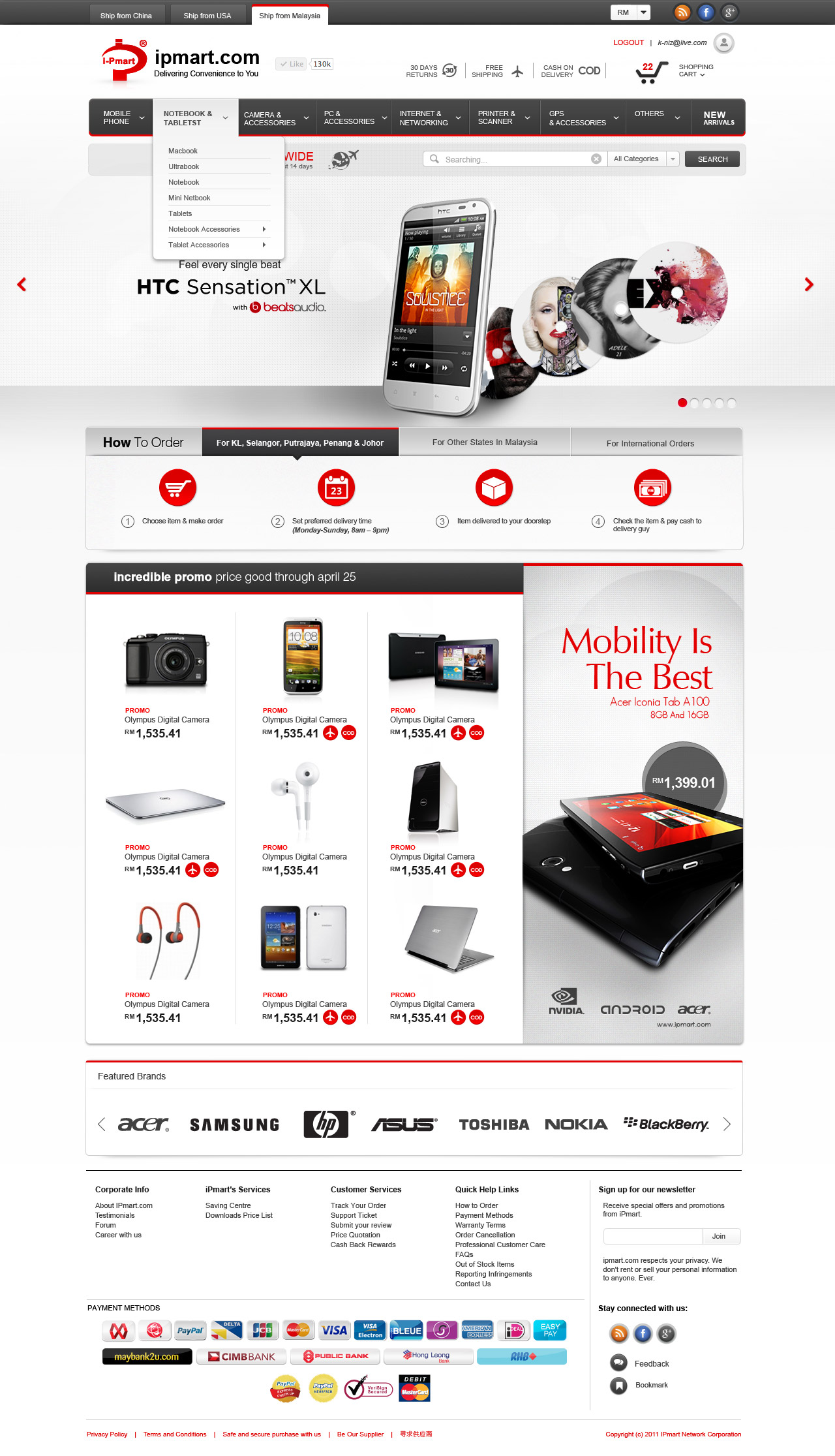
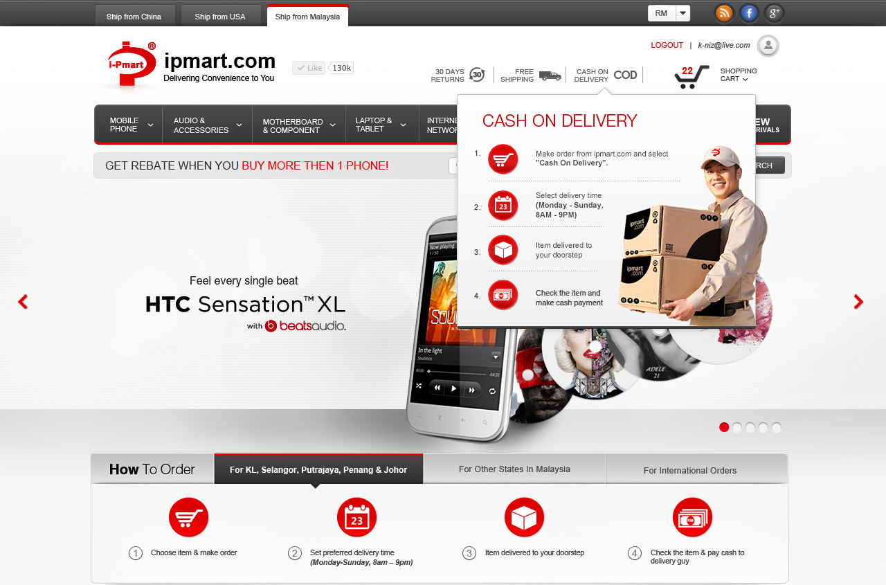
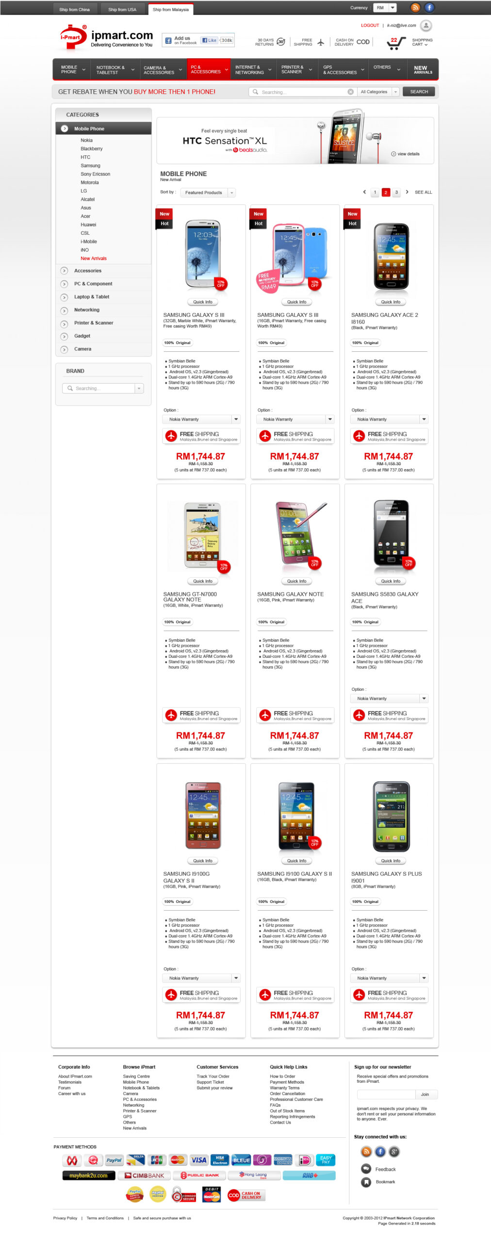
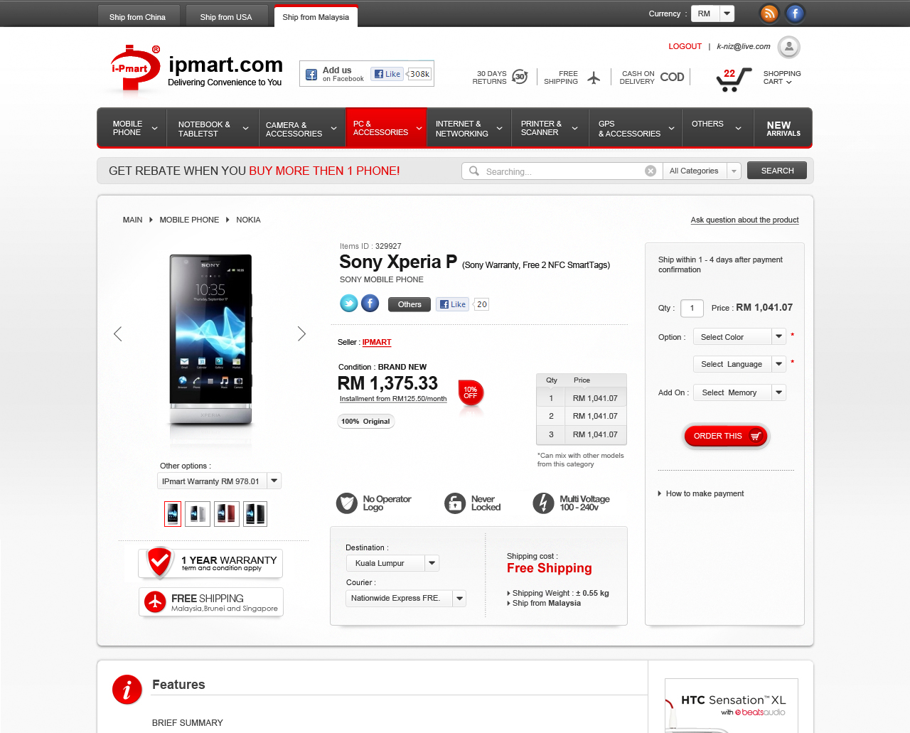
- Modern Interface:
The revamped design featured a clean and visually engaging layout that improved navigation and usability. - User-Centric Navigation:
Enhanced category organization and search functionality to make product discovery seamless. - Consistency:
Standardized UI elements and visual assets through a cohesive design system.
02.
Solution
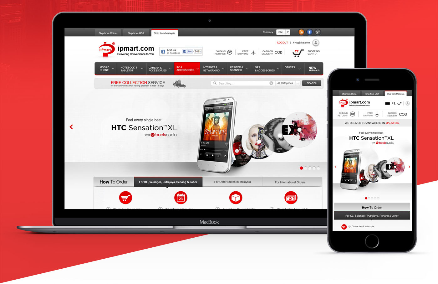
Mobile Design:
Created layouts for mobile devices to ensure usability.

03.
Impact
Improved usability, allowing users to browse and purchase products more efficiently.
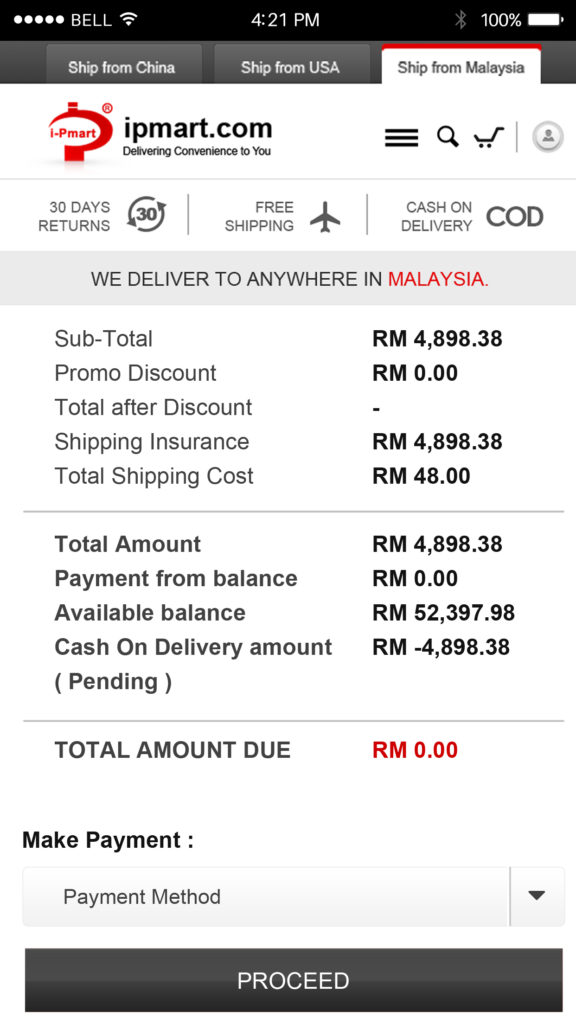
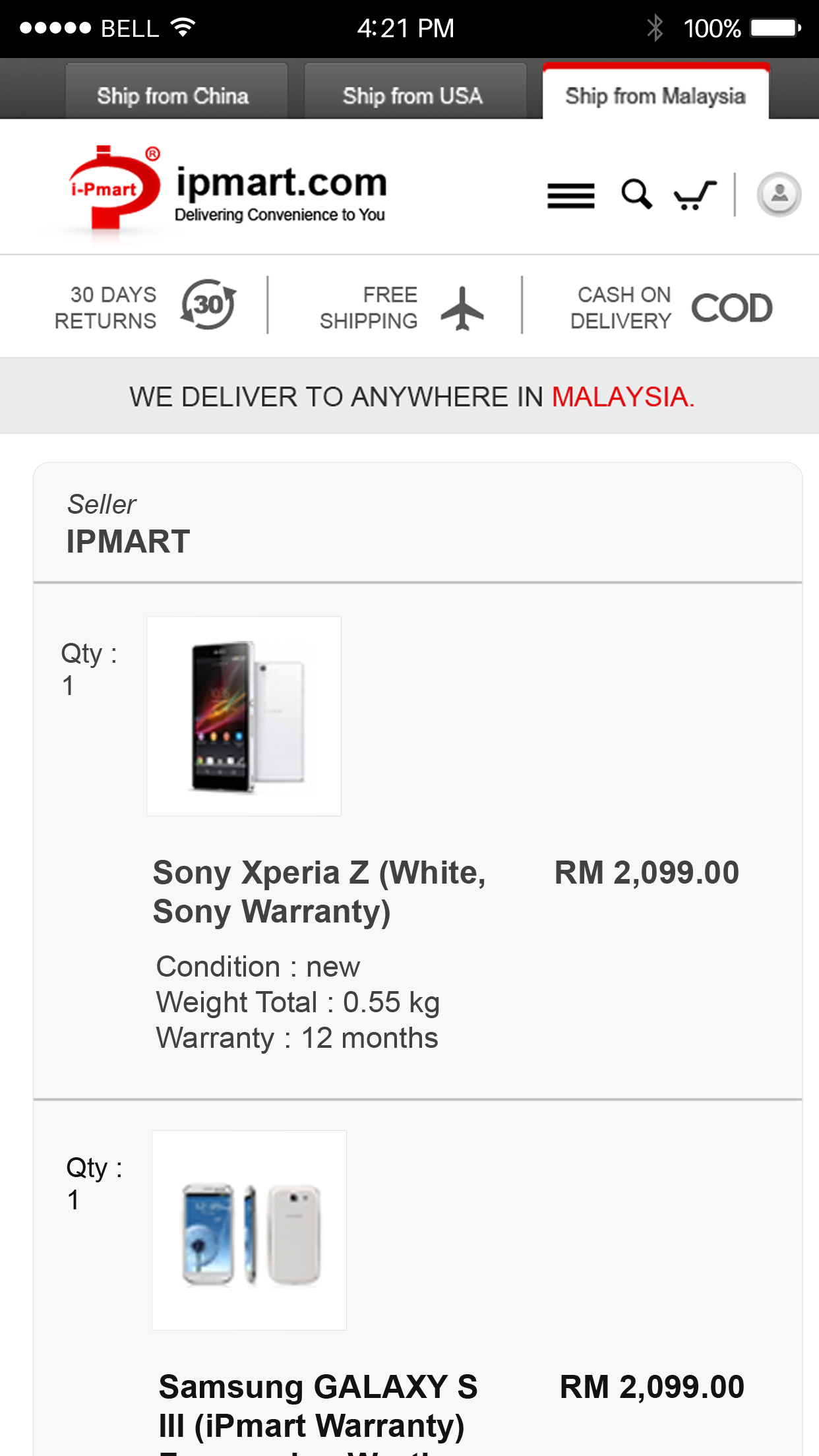
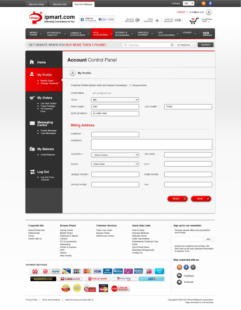
Supporting Visuals
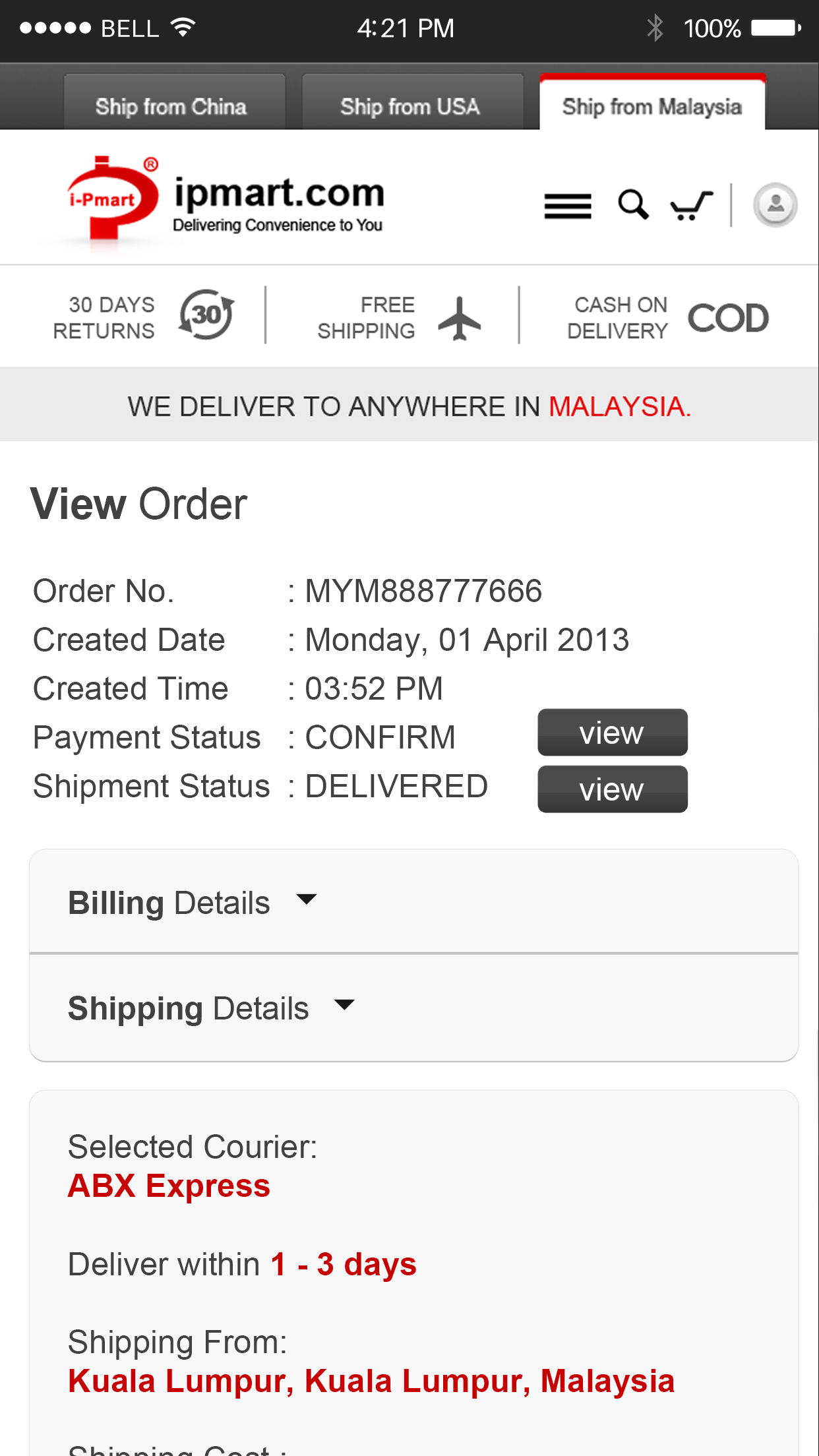
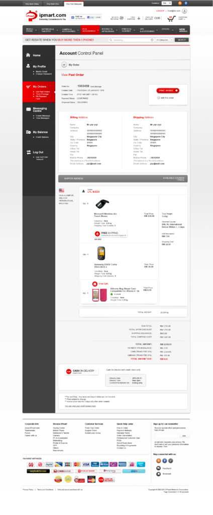
User Dashboard
Designed a dashboard interface for users to manage their accounts, track orders, and interact with their settings efficiently.
User Dashboard
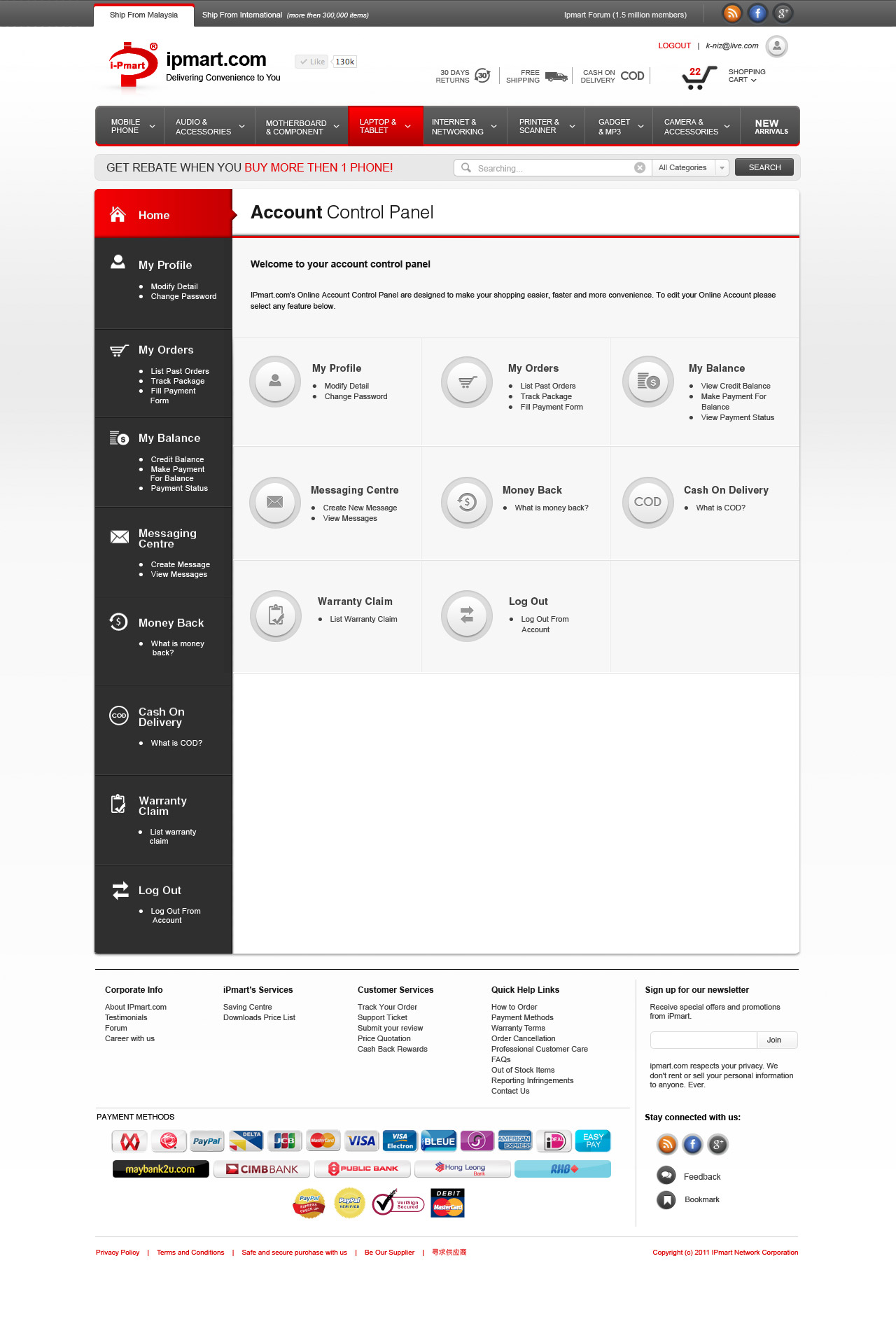
Profile Page
Orders
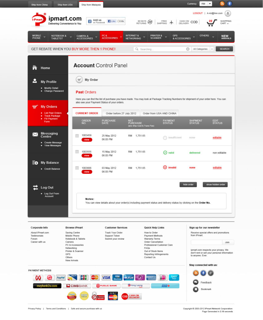
Past Order
Landing Page for Merchants
Created landing pages for major merchants like Astro, Celcom, and Maybank, focusing on branding alignment and clear calls-to-action for merchant offers.

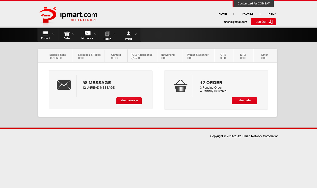
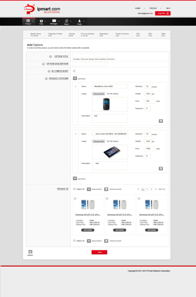
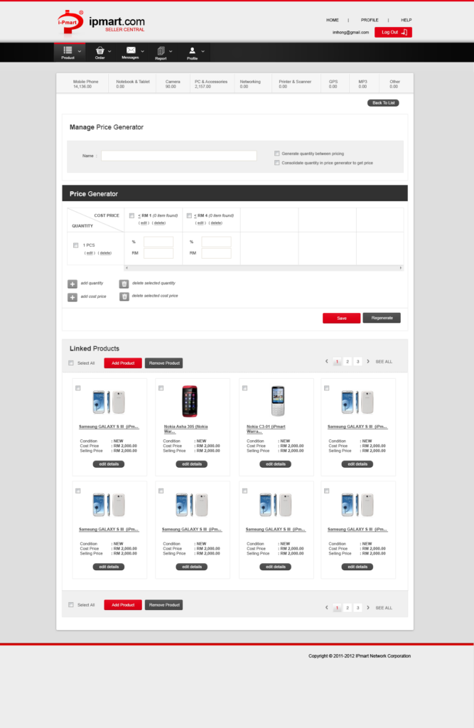
Seller Panel
Developed a dedicated panel for sellers to manage their inventory, track sales, and view analytics, with an emphasis on usability and functionality.
Main Page Seller
Product Option
Price Generator
Personal Takeaway
This project taught me the importance of approaching redesigns in phases to achieve measurable improvements while minimizing disruptions for users. Collaborating closely with the senior developer and reporting directly to the CTO emphasized the value of aligning design with both technical and business goals.