(01)
— Overview
SweetSpot is a loyalty and marketing SaaS platform offering rewards, vouchers, coupons, and e-wallet solutions. Originally launched as a single-client app, the product faced challenges in scalability, usability, and brand consistency.
As the platform grew, the business made a strategic shift into a B2B white-label solution — enabling multiple clients to adopt the app under their own branding while still leveraging the same modules and features.
My role was to revamp the app’s UI/UX, establish a scalable design system for white-label adoption, and improve key user journeys such as voucher redemption and e-wallet transactions.
— My Role
I joined as an Assistant Manager, UI/UX Designer and later transitioned to Assistant Product Manager, Senior UX Designer, bridging design and product strategy. I collaborated with cross-functional teams (product owner, developers, and client) to:
Ensure that the CMS to app flow worked seamlessly, regardless of industry.
— Responsibilities
- Led the UI/UX revamp to support a multi-industry, white-label model.
- Create a Product CMS & App Product Guideline to standardize onboarding and reduce client confusion.
- Built a scalable design system for white-label adaptability.
- Simplified redemption and wallet flows to improve usability.
- Partnered with Product Owner on client requirements and module rollout.
- Collaborate with engineers to ensure design tokens supported branding flexibility.
— Team Involved
GM (Decision Maker)
Product Designer
Marketing Team
Developers
(02)
Research Insights
User & Stakeholder Voices
“It’s too hard to find the vouchers I want.”
End User
“Every client wants their logo and colors, we need a way to scale.”
Developer
“We spend too much time explaining CMS during onboarding.”
Marketing
Through user research and stakeholder discussions, key pain points surfaced:
For end-users
- Redemption process was lengthy and confusing.
- Wallet history lacked transparency.
- Inconsistent campaign visuals caused trust issues.
For business & clients
- The app was built for a single client, making onboarding new clients slow and costly.
- No framework for applying different brand identities.
- Clients were often confused about how CMS inputs (banners, offers, campaigns) would appear in the mobile app. This created dependency on the support team and slowed down implementation.
(03)
Product Solution
The solution combined usability improvements for end-users with scalability enablers for the business.
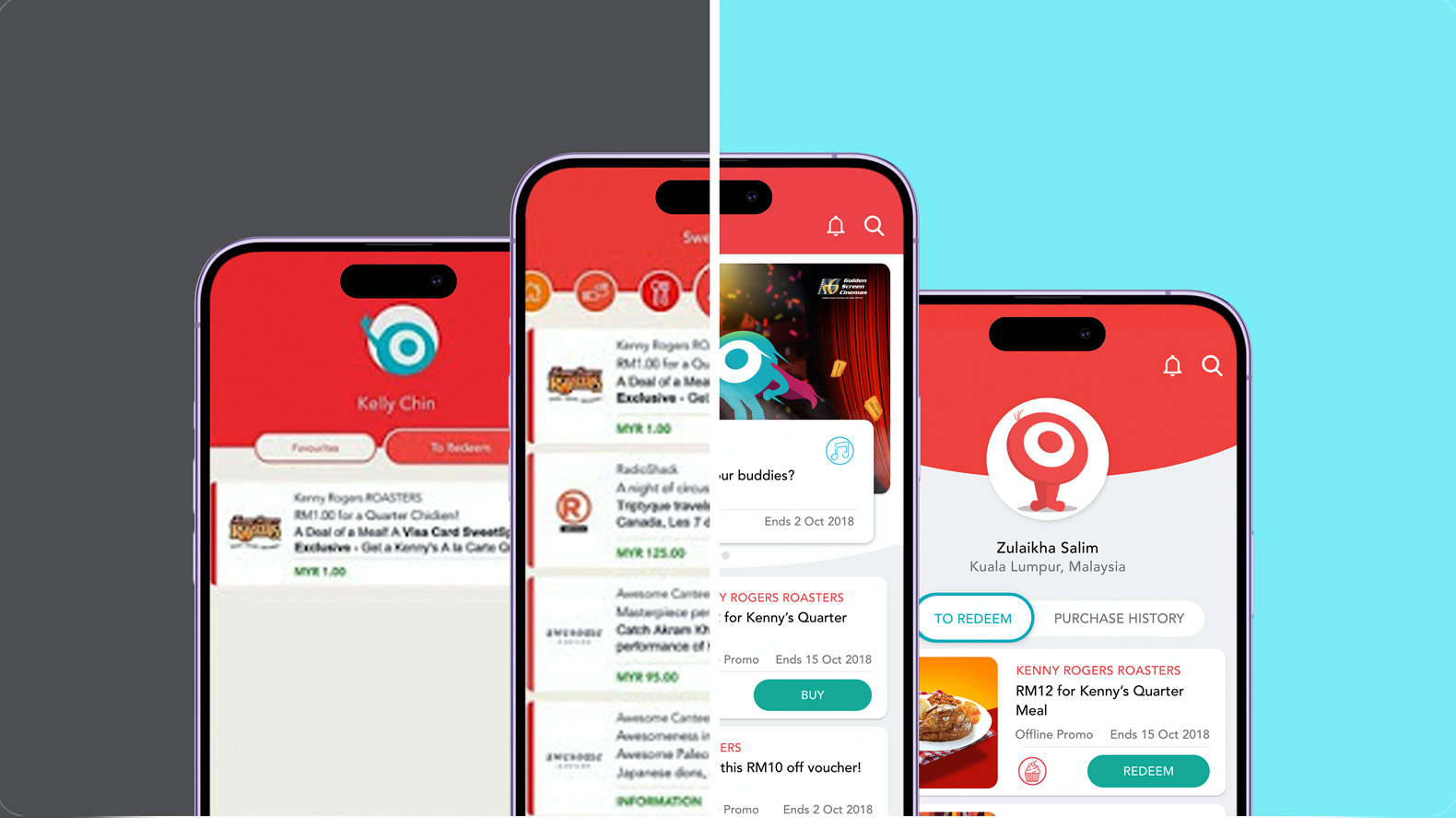
01. UI / User Experience Improvements
02. White-label scalability
03. Product Guidelines & Information Architecture
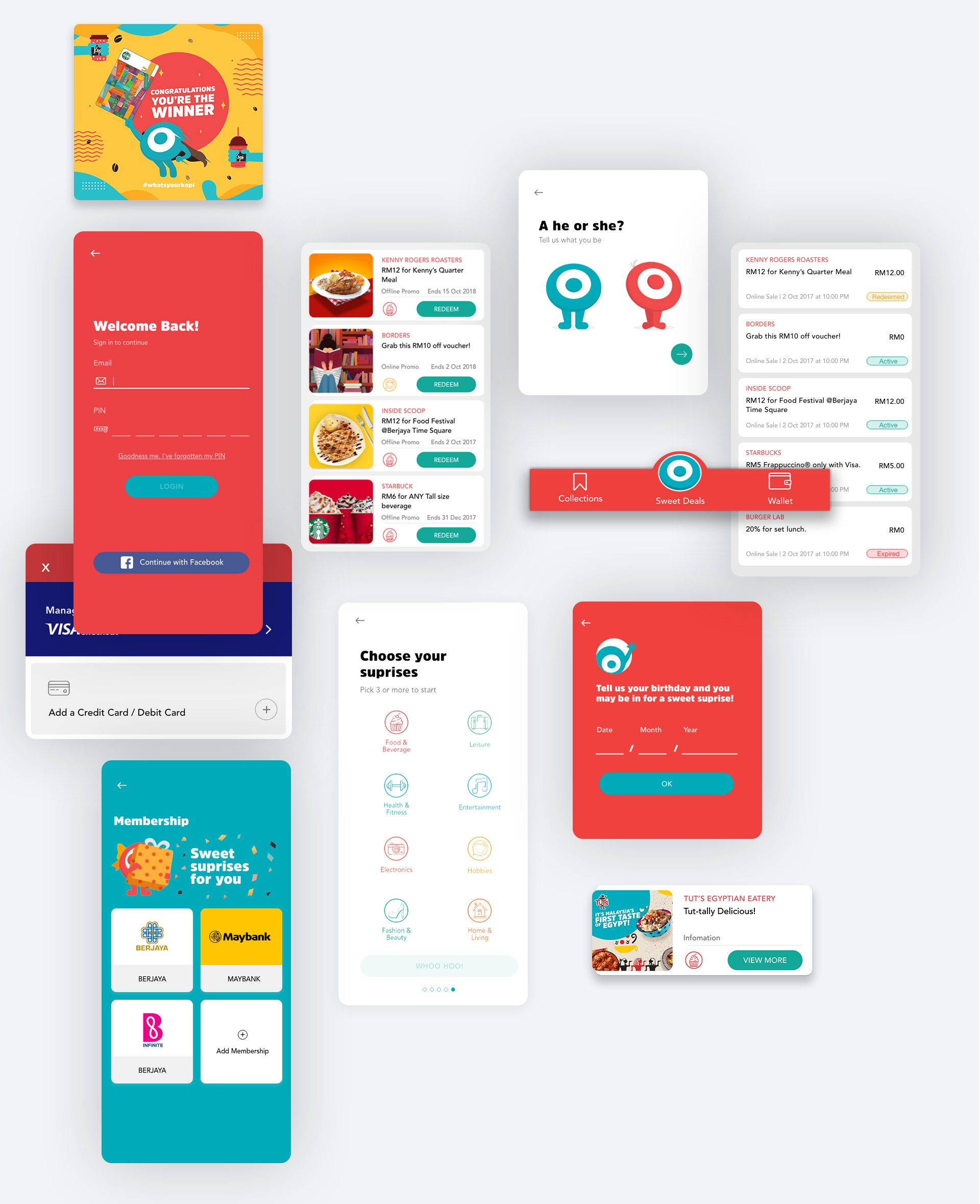
1. UI / User Experience Improvements
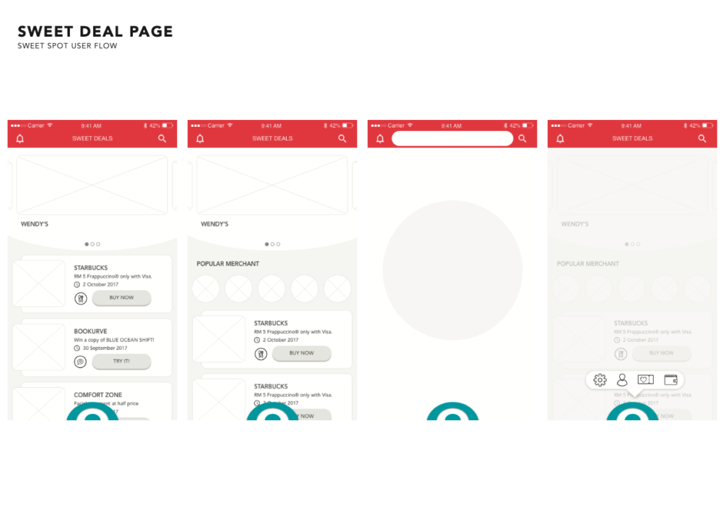
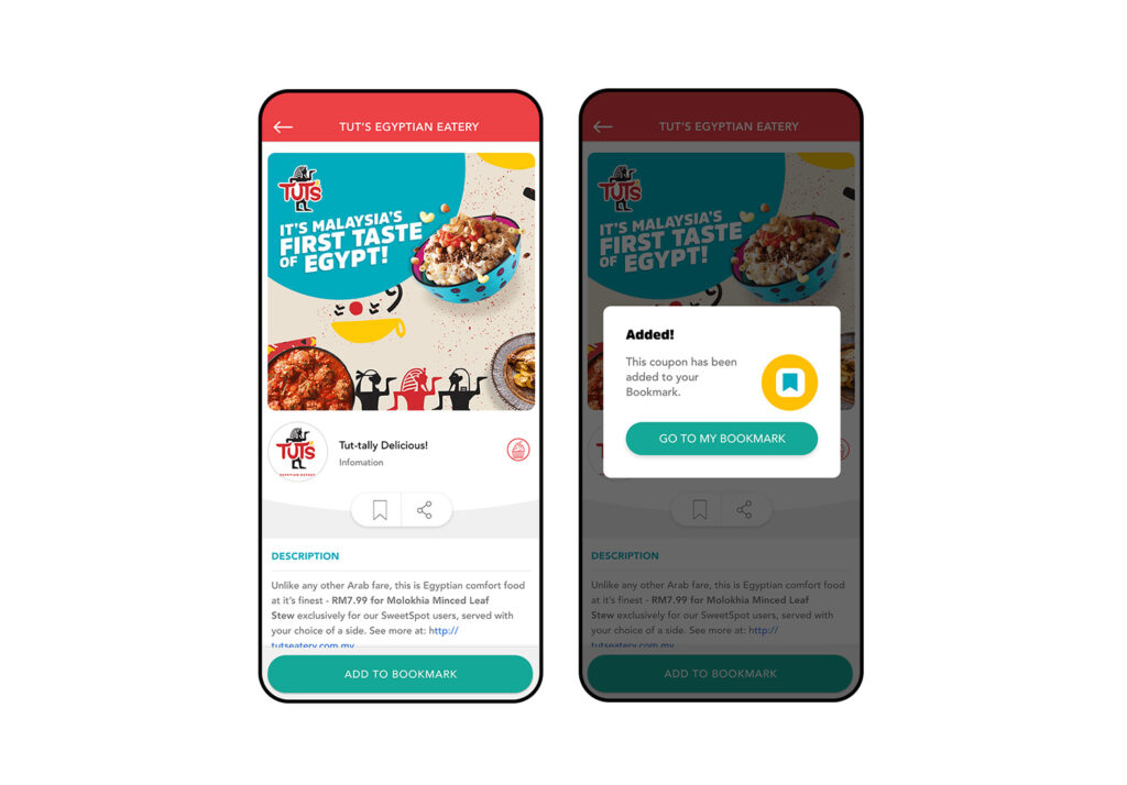
Bookmark – Sweet Saving
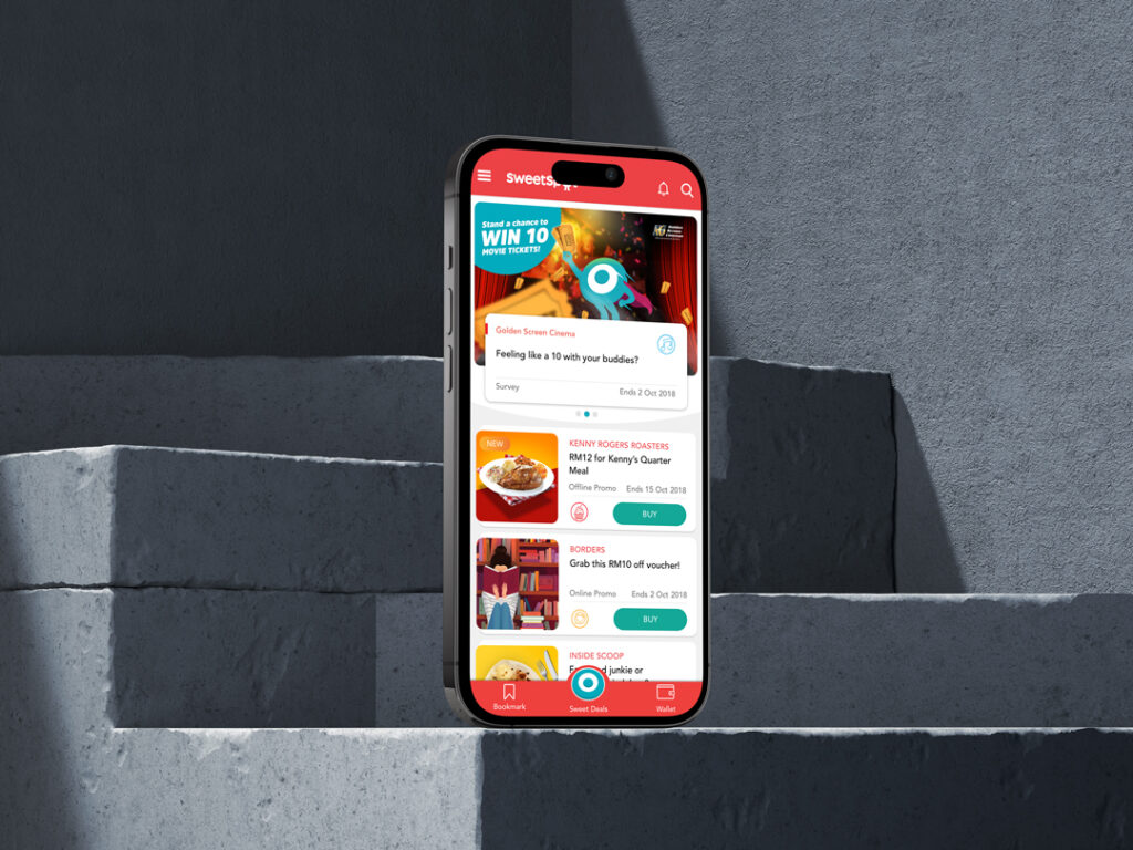
Enabled users to easily track favorite deals.
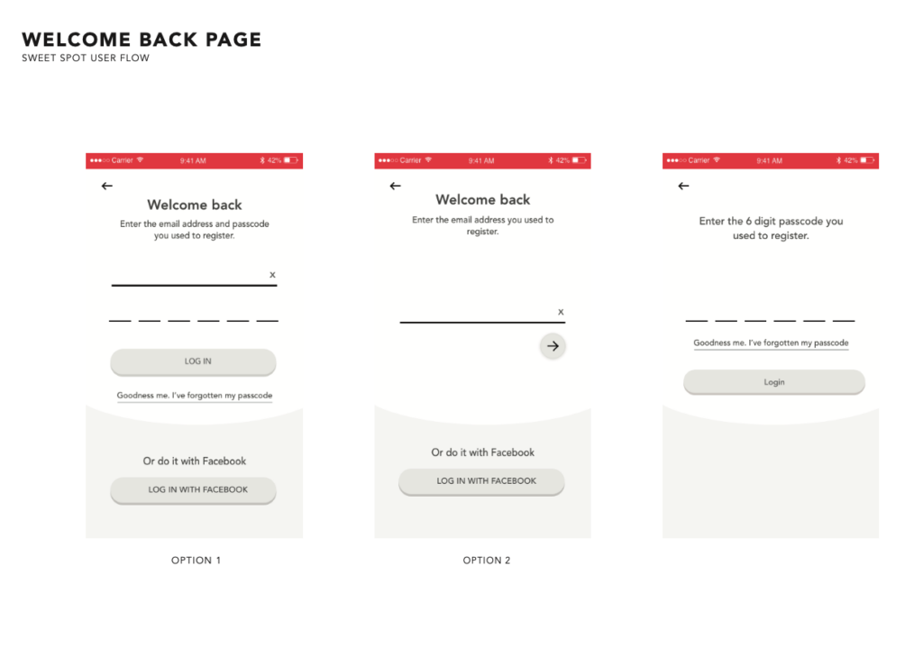
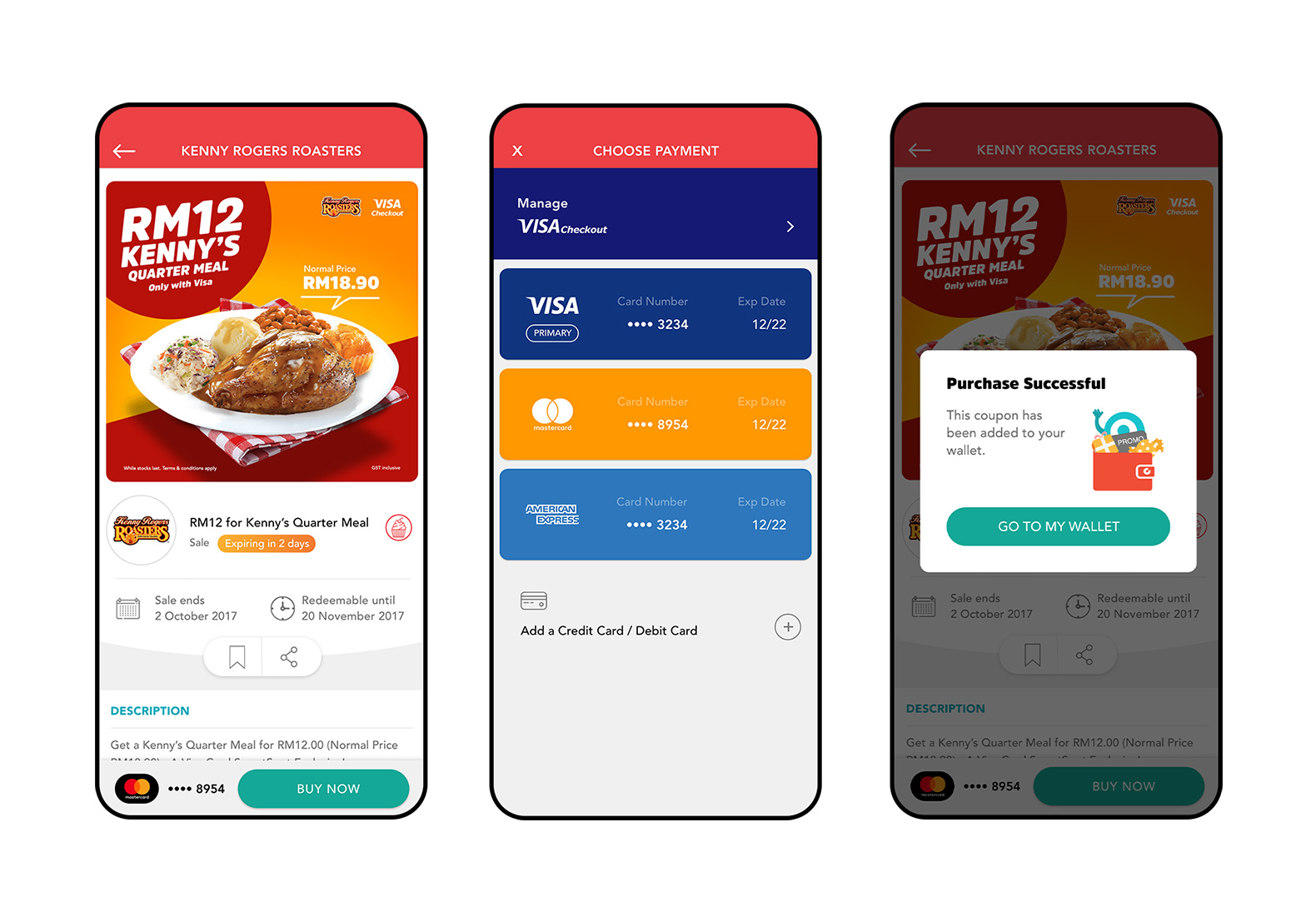
Secure Payment Flow
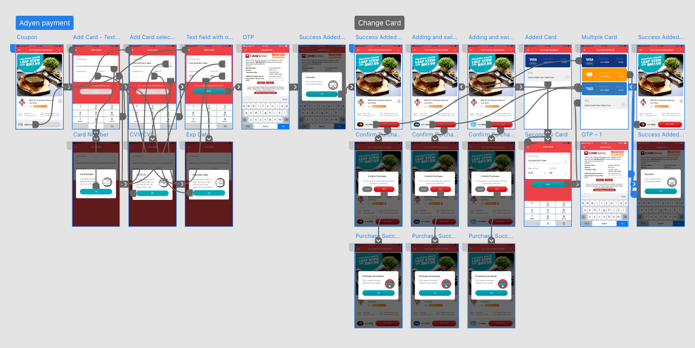
Simplified checkout with saved cards (Adyen) and Visa Checkout, improving both speed and security.
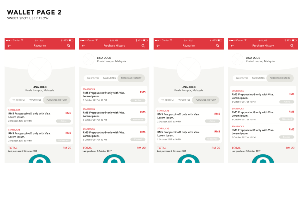
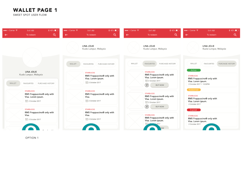
Wallet
Introduced a personalized wallet experience, including detailed transaction history and easy access to purchased deals.
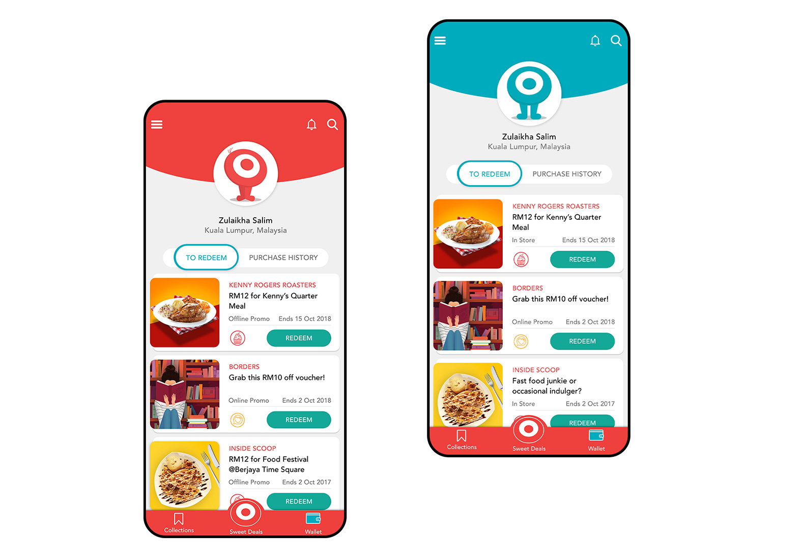
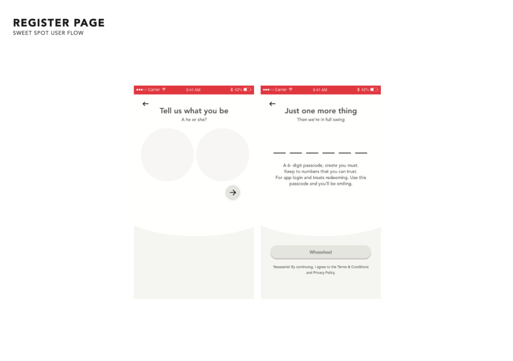
Blue for male users, red for female users
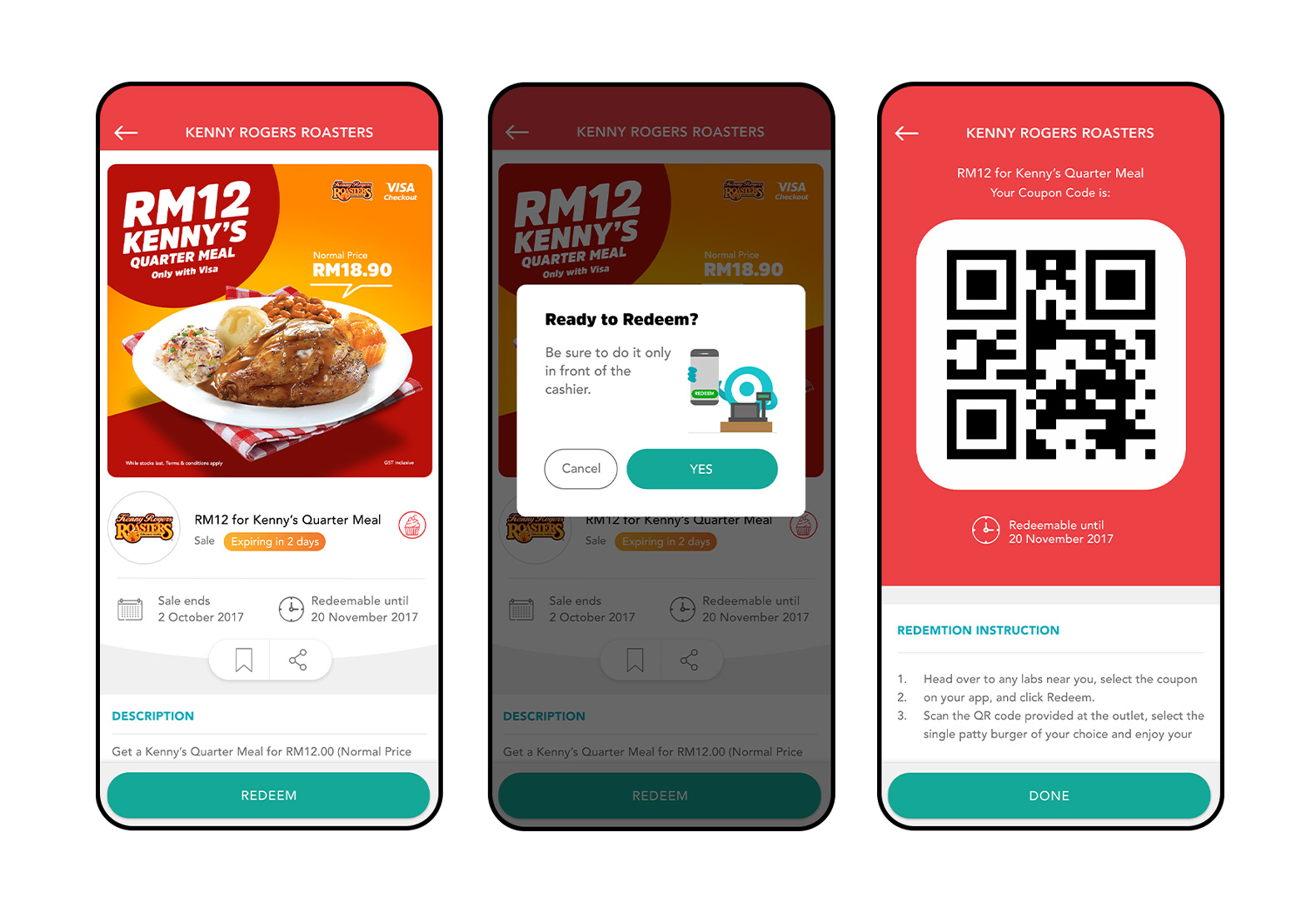
Redeem
Streamlined flow, reducing steps by 40%.
02. White-label scalability
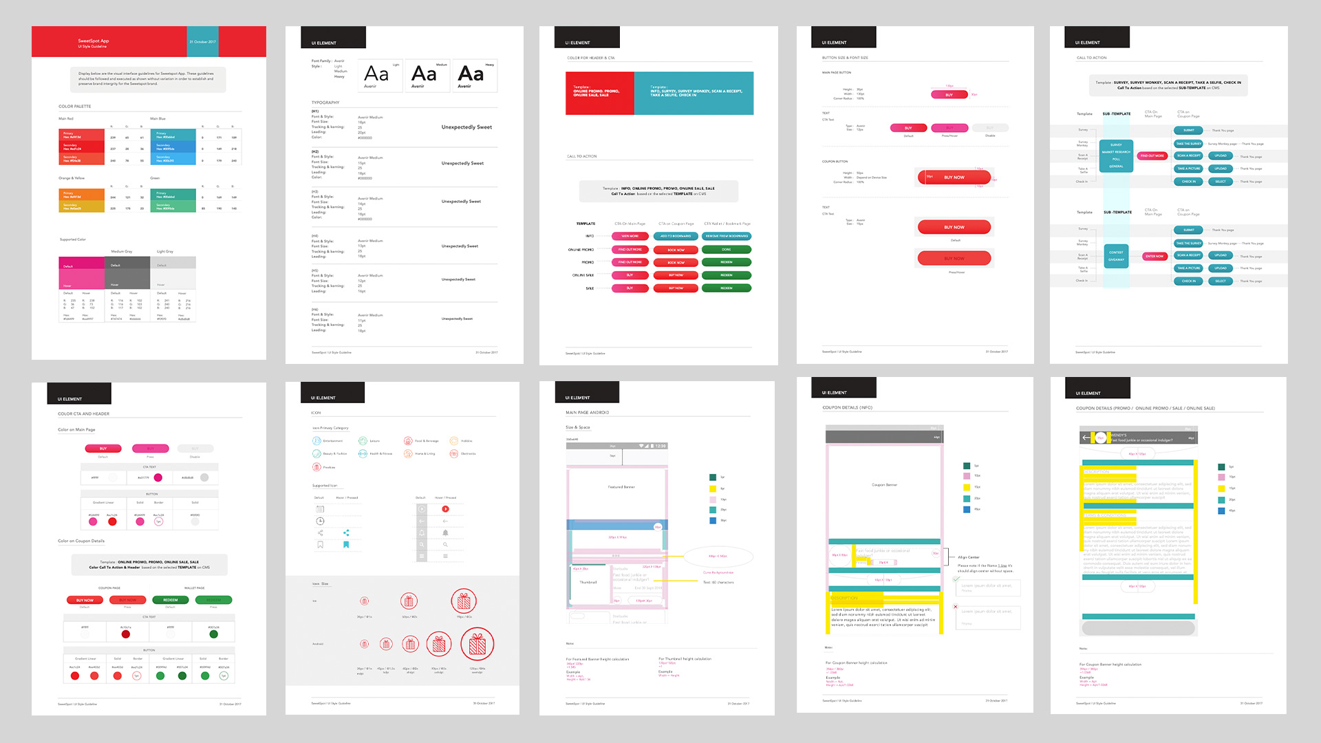
Design Tokens
Standardized typography, color, and components for easy branding across industries.
03. Product Guidelines & Information Architecture
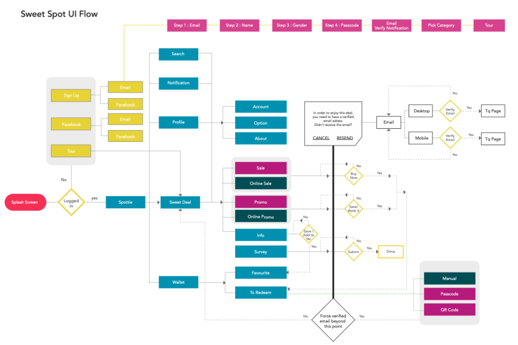
Information Architecture
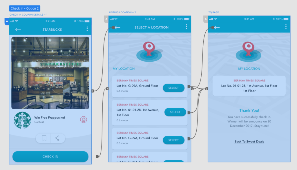
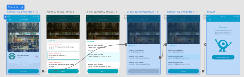
Designed IA diagrams and flows to clarify how modules connected and how users moved through the app.
Product Specification
Defined product specifications through IA and user flows, mapping mobile app journeys to ensure clarity on module functionality and appearance.
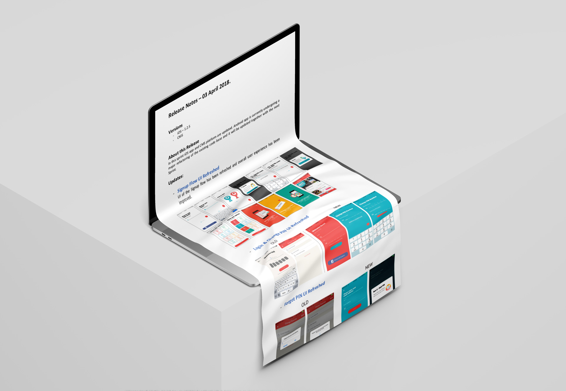
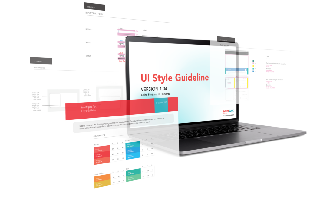
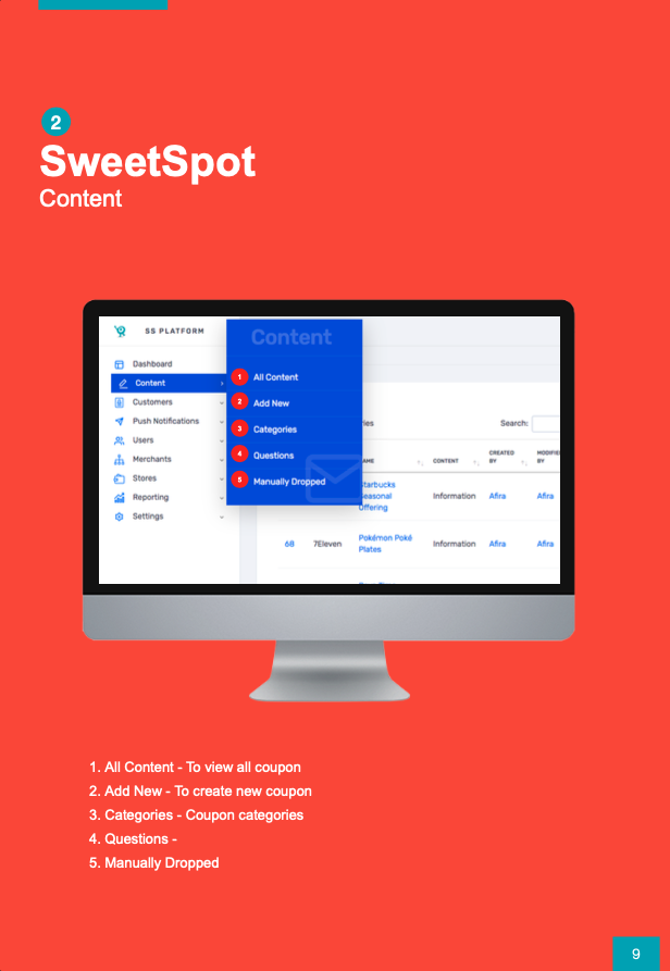
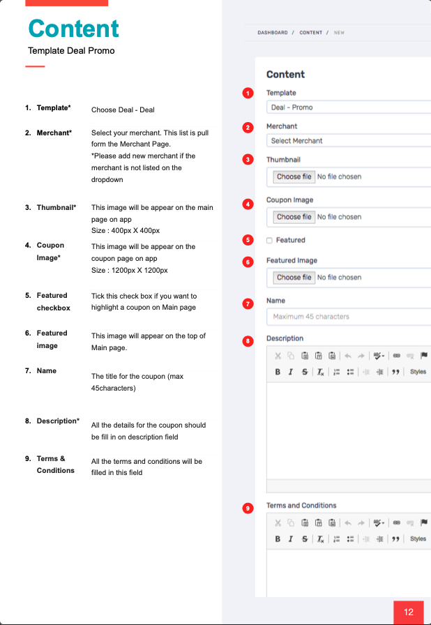
CMS Product Guideline
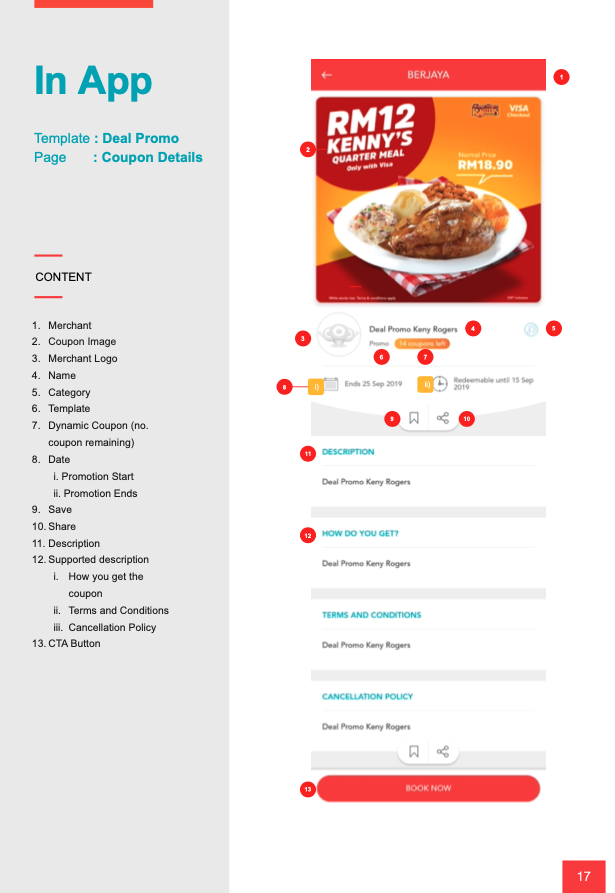
Created a visual guide mapping CMS fields to how they appear in the mobile app.
Testing & Refinement
Conducted usability testing, staging, and A/B testing for all modules.
(04)
Process
The project followed an iterative process across research, design, testing, and rollout. Initial user pain points were identified, followed by UI/UX revamps and CMS guidelines. White-label scalability and product specifications were developed in parallel with usability testing, before final deployment to clients.
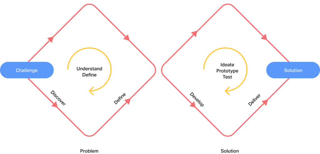
Discovery
Identified user and client pain points through research, interviews, and stakeholder discussions.
Define
Mapped information architecture, clarified CMS-to-app flows, and prioritized usability issues.
Develop
Revamped UI/UX, built scalable design tokens, and created CMS guidelines.
Deliver
Conducted usability testing (A/B & staging) and deployed to clients.
(05)
Outcome
The SweetSpot App successfully transitioned from a single-client loyalty app into a scalable B2B SaaS white-label solution.
Impact
- Clients could self-manage campaigns with less support.
- End-users enjoyed smoother redemption and wallet experiences.
- The CMS guideline reduced onboarding confusion and support tickets.
Personal Impact
This project marked my transition from Assistant Manager, UI/UX Designer to Assistant Product Manager, Senior UX Designer, where I learned to balance business scalability with user experience.
By redesigning the app and introducing a white-label design system, I helped transform it from a single-client product into a scalable SaaS solution. The experience reinforced the value of cross-functional collaboration and clear product guidelines in enabling client independence while improving user outcomes.
Other Processes Involved
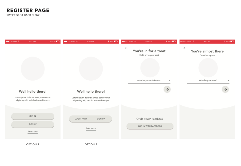
- Wireframes → Low-fidelity explorations to test flows before UI polish.
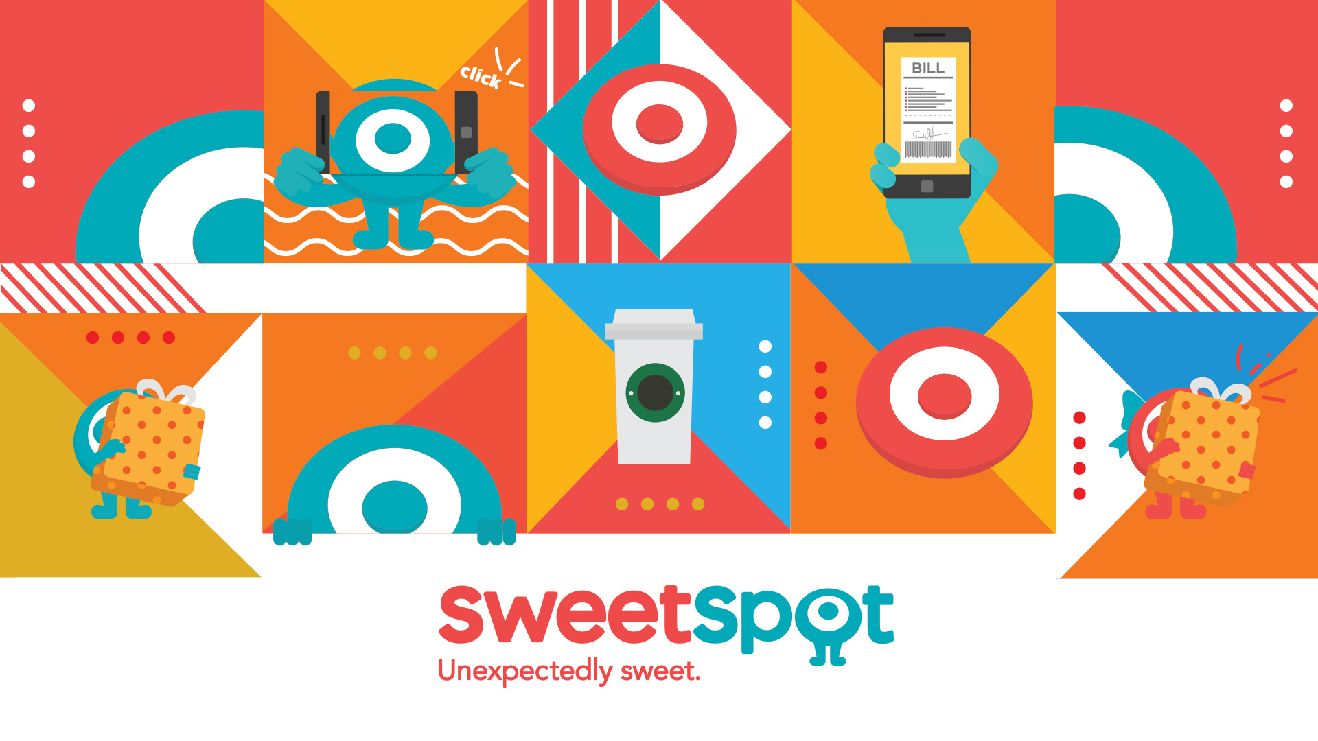
- Illustrations & Empty States → Friendly visuals to improve engagement when no data was present.
- Iconography & Assets → Created consistent icons and supporting assets aligned with the design system.